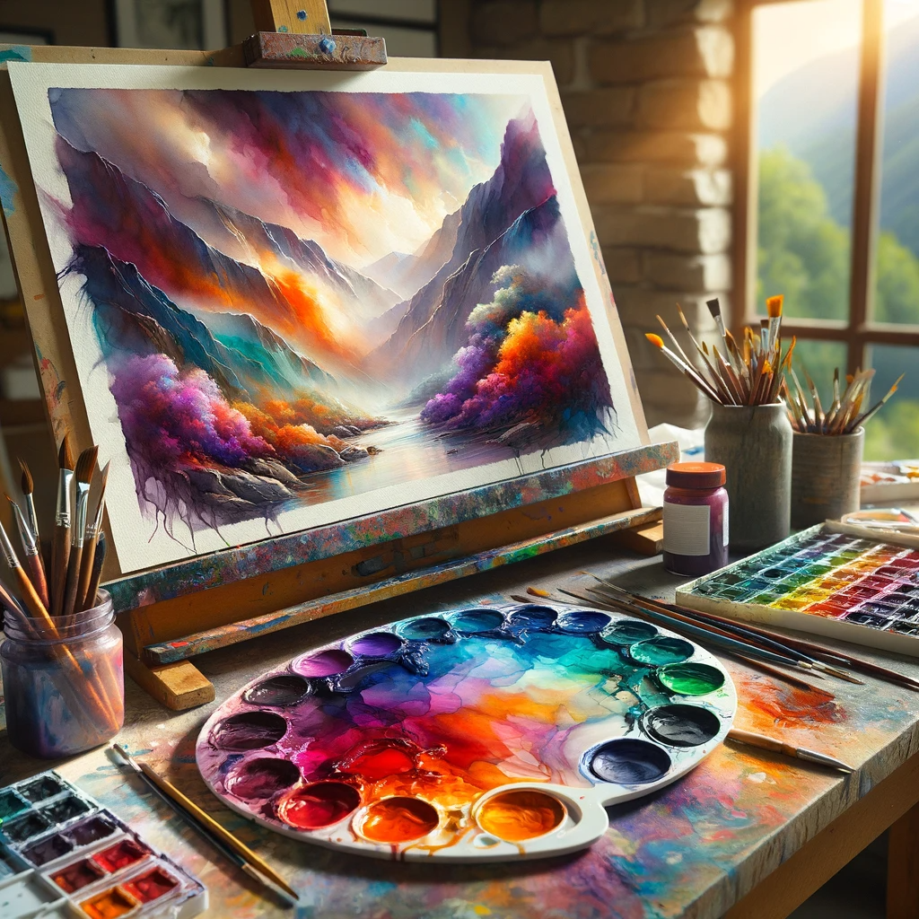
The art of color mixing in watercolor painting is akin to a symphony, where each hue plays a crucial role in creating a harmonious and evocative composition. For English writers and artists, mastering this aspect can elevate their artwork, enabling them to convey mood, atmosphere, and depth with nuanced shades and tones. This guide will explore the fundamentals of color mixing, providing the knowledge and techniques to enrich your watercolor paintings with vibrant and dynamic colors.
The Basics of Color Theory
Understanding color theory is the foundation of effective color mixing. The color wheel, with its primary (red, blue, yellow), secondary (orange, green, purple), and tertiary colors, serves as a roadmap for creating a vast spectrum of hues. Familiarizing yourself with concepts like warm and cool colors, complementary colors, and color harmony is essential for achieving balance and contrast in your artwork.
Watercolor Paint Properties
Watercolor paints have unique characteristics that affect color mixing. Transparency, granulation, and staining properties can influence the final appearance of mixed colors. Selecting the right quality and type of paint is crucial for achieving the desired effects in your watercolor artwork.
Mixing Techniques
- Wet-on-Wet: Mixing colors directly on wet paper allows for soft, seamless blends and gradients. This technique is ideal for creating atmospheric backgrounds and gentle transitions between hues.
- Wet-on-Dry: Applying wet paint to dry paper offers more control and produces sharper, more defined mixes. It’s perfect for detailing and layering colors without them bleeding into each other.
- Glazing: Layering thin, transparent washes of different colors can create depth and luminosity. Each layer must dry completely before applying the next to prevent muddying.
Color Mixing Tips
- Limited Palette: Starting with a limited palette can help you understand the mixing potential of a few colors and how they interact. It encourages creativity and can lead to a more cohesive color scheme in your artwork.
- Mixing on the Palette vs. Paper: Experiment with mixing colors on your palette and directly on paper to see the diverse effects each method produces. Direct mixing on paper can yield surprising and organic results, adding a lively quality to your work.
- Test Swatches: Always test your color mixes on a separate piece of paper to ensure they meet your expectations before applying them to your artwork. This practice can save you from unwanted surprises and help you build a personal color mixing chart.
Advanced Color Mixing Strategies
- Neutral Tones: Mastering the mix of complementary colors to create neutral tones and grays can add sophistication to your artwork. These tones can balance vibrant colors and add a sense of realism.
- Temperature and Mood: Pay attention to the temperature of colors (warm vs. cool) to set the mood of your painting. Warm colors can evoke feelings of warmth and light, while cool colors can convey calmness and distance.
- Color Harmony: Experiment with different color schemes (analogous, complementary, triadic) to achieve visual harmony in your artwork. Understanding how colors work together can enhance the overall impact of your paintings.
Conclusion
Exploring color mixing in watercolor painting opens up a world of creative possibilities. By understanding the basics of color theory, experimenting with different mixing techniques, and applying advanced strategies, you can infuse your artwork with depth, emotion, and vibrancy. Remember, the journey of mastering color mixing is a process of continual learning and experimentation, so embrace the adventure and let your colors sing!